A marketing team can approve a message in a document and still get a surprise when it becomes handwriting. The words have to share a small physical space with margins, line breaks, and the shapes of the letters. A fixed character count catches very long text, but it cannot tell the whole story.
We measured the layout produced by Scribble’s own fitting software for five invented business notes across 30 active handwriting styles. We added three control strings to check the effects of letter width and line breaks. The full 240-row dataset and the exact note corpus are available below. Nothing in this test measures open rates, response, customer preference, or physical print quality.
What the five business notes showed
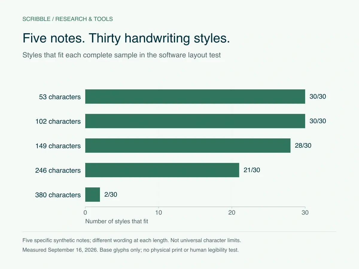
The shortest note had 53 characters and a simple greeting, thank-you, and sign-off. The longest had 380 characters and several details about a project rollout. Each text stayed identical when we changed handwriting styles. The only question was whether that combination fit within the software’s configured writing area and size limits. [1]
Scroll the table horizontally if needed.
| Note | Characters, including spaces | Words | Styles that fit |
|---|---|---|---|
| Brief thanks | 53 | 9 | 30 of 30 |
| Specific thanks | 102 | 18 | 30 of 30 |
| Meeting follow up | 149 | 28 | 28 of 30 |
| Project wrap | 246 | 45 | 21 of 30 |
| Longer project wrap | 380 | 71 | 2 of 30 |
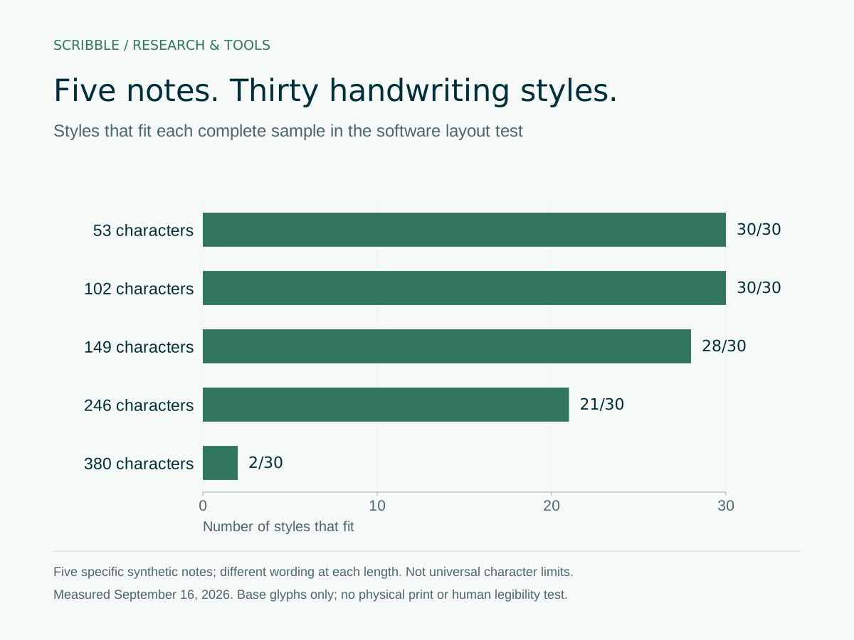
All 30 styles fit the 53- and 102-character notes. At 149 characters, two styles reported overflow. At 246 characters, nine did; at 380, 28 did. That is a useful reason to preview before a mailing, but it does not establish that another 149-character note would have the same result. These texts differ in vocabulary and sentence structure as well as length. [1]
Why two notes with the same character count can behave differently
A narrow letter and a wide letter both count as one character. They do not take up the same horizontal space. We tested 180 uppercase W characters and 180 lowercase i characters as deliberately artificial controls. The wide control fit 28 styles and the narrow one fit 30. Neither is a realistic message; they help isolate why a character counter cannot substitute for the layout engine. [1]
Newlines have a different effect. They force the text onto another line even when there is room across the page. Our line-break control repeated “Hi” followed by a newline 45 times. It overflowed in all 30 styles. A message can therefore be short in words and still be too tall for the card. [1]
What fit means in this study
We used the bundled base glyphs and the production autoFitSize function. The writing leaf was 108 × 140 mm; the actual text area also respected the configured message box and margins. The fitter adjusted the size within the implementation’s limits and reported whether the measured text overflowed. The dataset records the chosen size and the overflow flag for every combination. [2]
A successful software fit is a geometric result. It does not prove that a person finds the note easy to read, that a physical card passed an inspection, or that a recipient likes the message. The lowercase and capital measurements in the CSV describe modeled pen paths. They are not reading-test scores. [2]
This run did not request Scriptalizer variants. The final designer and production flow use confirmed handwriting variants, which can change widths or flourishes. Use the live preview as the decision point for the message you will actually send. The base-glyph results are a planning aid and a reproducible comparison. [2]
A practical starting point for a customer note
Start with the reason you are writing. Name the contribution, conversation, or milestone, then say what you want the recipient to know. A business note does not need to carry the whole follow-up email. Details such as meeting minutes, several links, or a complete implementation plan usually need another place to live.
The 102-character note used in this study
Hi Dana, Thank you for testing the new checklist. Your notes made the next version much clearer. Sam
Invented public example. Names and circumstances are illustrative.
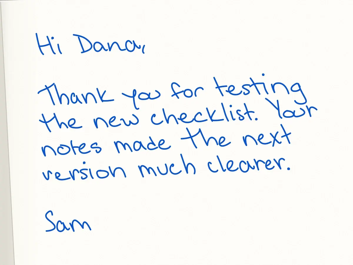
This example refers to a particular contribution: testing a checklist. It makes one acknowledgment and stops. If your own version needs a little more context, add it, then check the preview. There is no reason to delete a useful detail solely to match the character count of this sample.
Before shortening, look for duplicated thanks, a long job title in the sign-off, or a sentence that merely announces you are sending a card. Those are easier edits than removing the detail that makes the note worth receiving. Keep the tone your organization would use in an ordinary conversation.
Check the longest merged message before approving a batch
A template is not the same as the completed messages. A short sample name can fit while a longer recipient name or company name changes the wrapping. A custom field may be empty for one contact and several words long for another. Review the finished text for the people in the actual mailing, especially the longest versions.
A small proofing sequence
Write the complete note
Include the greeting, exact punctuation, paragraph breaks, and sign-off.
Check the variable fields
Inspect long values, missing values, and the fallback wording used when a field is blank.
Preview the intended handwriting
Look for overflow and awkward wrapping in the final text, not just the source template.
Make a deliberate edit
Shorten a sentence, remove an unnecessary break, or choose another style, then preview again.
Keep the approved version
Record the message and handwriting choice so another edit does not bypass the proof.
What this dataset can and cannot answer
You can use the CSV to reproduce the summary table, compare the five fixed notes within a handwriting style, and see which controls failed. A team choosing a starting template can examine whether its preferred style was sensitive to the longer examples. The method download includes the exact source-file hashes so a later run can be compared against the same implementation.
- The sample is five invented notes and three controls, not a representative sample of all business correspondence.
- The result concerns this software version and these 30 active styles on the checked date.
- Character count includes whitespace and punctuation. A word count alone loses some of that information.
- The test has no recipient behavior, delivery, campaign, revenue, or customer data.
- No physical cards or human reading trials were part of this measurement.
For a published chart or report, describe the finding as a Scribble software-layout test and link to this page. Keep the date and the fixed-note limitation beside the number. Calling 28 of 30 a general success rate for handwritten cards would change what was measured.
Use the result to make one better mailing decision
The useful decision is whether your team should shorten, reformat, or re-preview a specific note before committing it to a mailing. The study does not identify one universally best handwriting. A style that fits a long note is not automatically the right voice for your organization.
If the physical presentation is important to the decision, order a sample and inspect the real paper and pen strokes. If the message is already decided, test it in the actual designer before importing a large list. The next approval should be based on the final words and the final preview, with a named person responsible for checking them.
Frequently asked questions
How many characters should a handwritten business card contain?
There is no universal number in this study. The 102-character example fit all 30 tested styles, but other wording of the same length can wrap differently. Write a concise, specific note and preview the exact final message in the intended handwriting. [1]
Did Scribble test actual printed cards or customer response?
No. This was a software-layout measurement using bundled base glyphs. It did not include physical printing, readers, mailed cards, opens, replies, purchases, or customer data. [2]
Can I use the CSV to compare handwriting styles?
Yes, for the fixed notes and controls in the dataset. Compare like-for-like rows and retain the software version and measurement date. The result does not rank handwriting by attractiveness or readability.
Why can the final preview differ from a row in the dataset?
The live workflow uses confirmed handwriting variants, while this study used base glyphs for a controlled comparison. Edits to the wording, names, spacing, or software can also change wrapping. Approve the final preview rather than relying only on the planning dataset. [2]
Sources and methodology
Reviewed .
Original Scribble software-layout analysis, measured September 16, 2026. Thirty active styles, five fixed invented business notes, and three controls produced 240 observations. Base glyphs only; no supplier variants, physical-print tests, readers, or customer outcomes. Source fingerprints and the full note corpus are included in the downloads.
- Scribble 240-row software-layout measurements
Scribble · Accessed
First-party measurements of invented notes, not customer outcomes.
- Layout method, source fingerprints, and exact note corpus
Scribble · Accessed